
Website design for a modern music licensing service
Playful line-art, collage elements, and bright colors for a website inspired by record covers and show fliers.
Marmoset is one of my favorite companies in Portland — not only are they a B-Corp, they’re also just great people. I was so excited to get to work on the design for their new marketing site with the Factory North team. We worked together to find a style for the site and then I applied that style to all of the required pages. There were quite a few different sections and components — so what you see below is just small sample.
If you check out the website now, you’ll see that it has a white background, instead of the black below. At the end of the project we decided to switch to the white, but I’m still quite taken with the black, so decided to present that here.
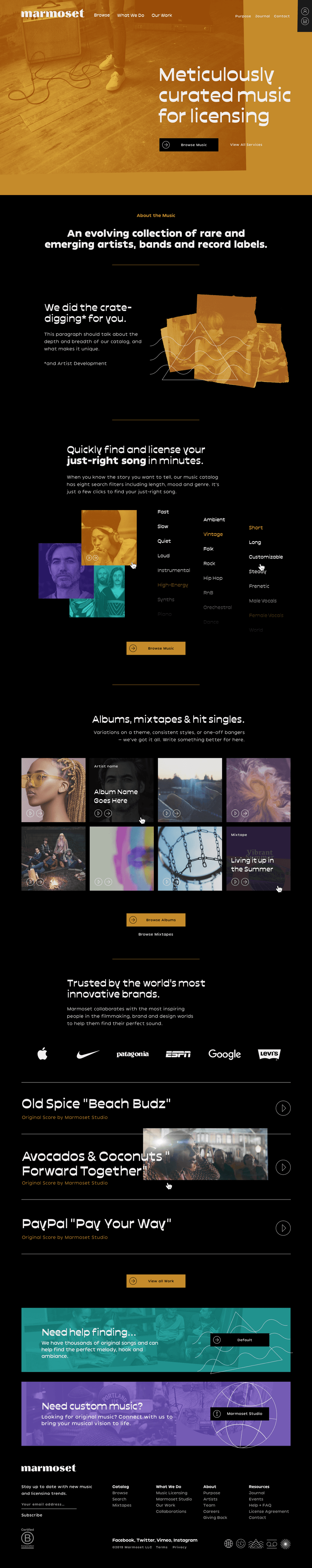
The Home Page
We structured the homepage to highlight the unique aspects of Marmoset through interactive, illustrative components.
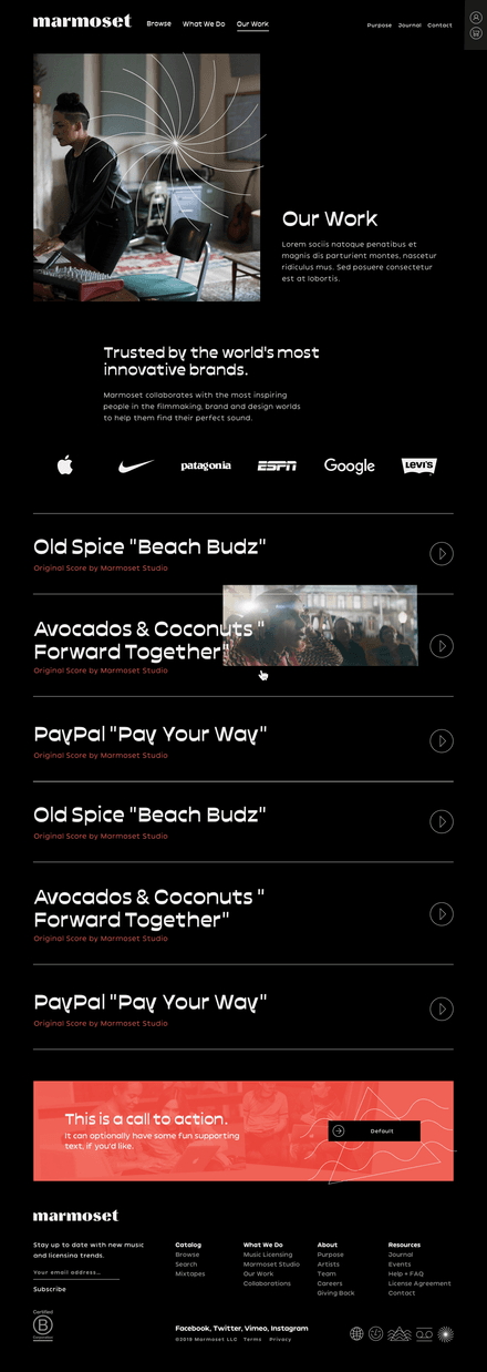
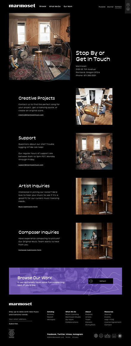
Interior Pages
We built out a design system and set of reusable components that could be used to build out a variety of pages. Here are a small sampling of the types of pages that are possible.
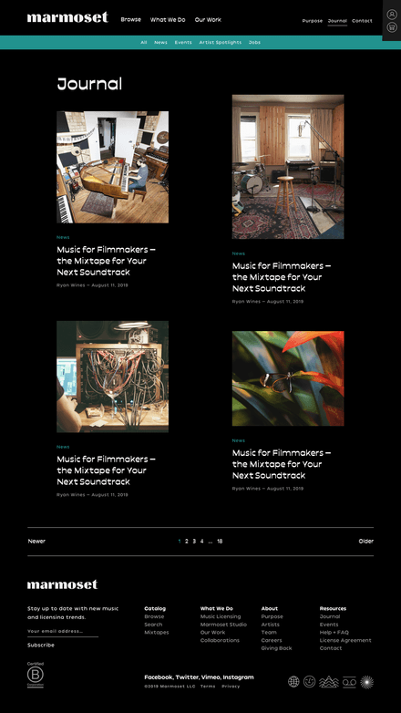
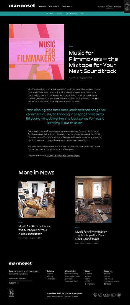
The Journal
We wanted to move away from the old-school two-column blog layout they had been using and designed a more modern, compelling — but yet simple, new layout.
I absolutely love collaborating on design with a good branding agency or freelancer and working with Tyler and Nicole on this one was a joy. Thanks to them and the wonderful Marmoset team for having me.
Next Project